Data Narratives
Turning Numbers into Narratives: The Art of Data Storytelling
Because dashboards don’t drive decisions. Stories do.
Data doesn’t speak for itself. It sits silently in spreadsheets and databases until someone makes sense of it. That’s where data storytelling comes in.
As a data analyst, my role goes far beyond charts and queries. I’m here to translate insights into action.
What Is Data Storytelling?
At its core, data storytelling is the ability to combine data, visuals, and narrative to communicate a compelling, actionable insight. It’s how analysts turn:
“Here’s what the data says” into,
“Here’s what it means, and here’s what we should do next.”
Why It Matters
Too often, stakeholders are presented with reports that are:
-
Overwhelmingly technical
-
Lacking context
-
Disconnected from business outcomes
Even the most brilliant analysis will fall flat if it doesn’t connect with the audience.
That’s why storytelling is more strategic skill than just fluff.
The Three Pillars of Data Storytelling
Data
- The foundation. Ensure the data is clean, reliable, and relevant. Choose metrics that tie directly to business goals.
Visuals
-
Use well-designed charts and graphs to reveal patterns and trends. Avoid clutter. Prioritize clarity. Choose the right chart for the story.
-
Example: Bar charts to compare performance, line graphs for trends, scatter plots for correlation.
Narrative
Here’s where the magic happens. Use natural language to guide the audience:
-
What’s the context?
-
What’s the surprising insight?
-
What’s the implication?
-
What action should be taken?
Case Study: From Data Dump to Decision
Let’s say I’m working with a client whose open enrollment participation dropped year-over-year. Here’s how I’d apply data storytelling:
-
Data: Pull participation rates by plan type and demographic
-
Visual: Use a line chart to show declining trends over 3 years
-
Narrative: “Participation in commuter benefits dropped 22% after the pandemic, but remote workers are still eligible. We may need to clarify this in onboarding materials.”
The result? A targeted solution, not just a vague observation.
Common Pitfalls to Avoid
-
Data overload – You don’t need every single chart. Focus on what matters.
-
Assuming knowledge – Always explain acronyms and context.
-
Leading with visuals – Start with the question, not the chart.
-
Neglecting the “so what?” – Every insight should point toward a decision.
Visual Mockup
Here’s an example of a simple, story-driven chart you might find in a benefits analysis:
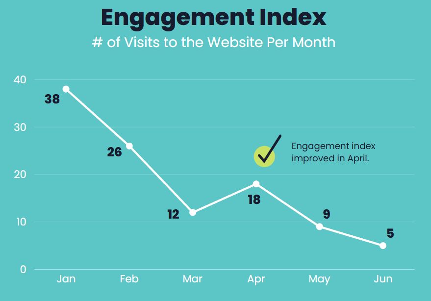
Even without words, this chart suggests a story. With the right narrative, it becomes a call to action.
Final Thought: Stories Change Minds
Data analysis is powerful. But data storytelling is what makes it understandable, persuasive, and memorable.
Whether I’m analyzing participant behavior or uncovering business inefficiencies, I always ask myself:
“How can I turn this data into an accurate and impactful story?”